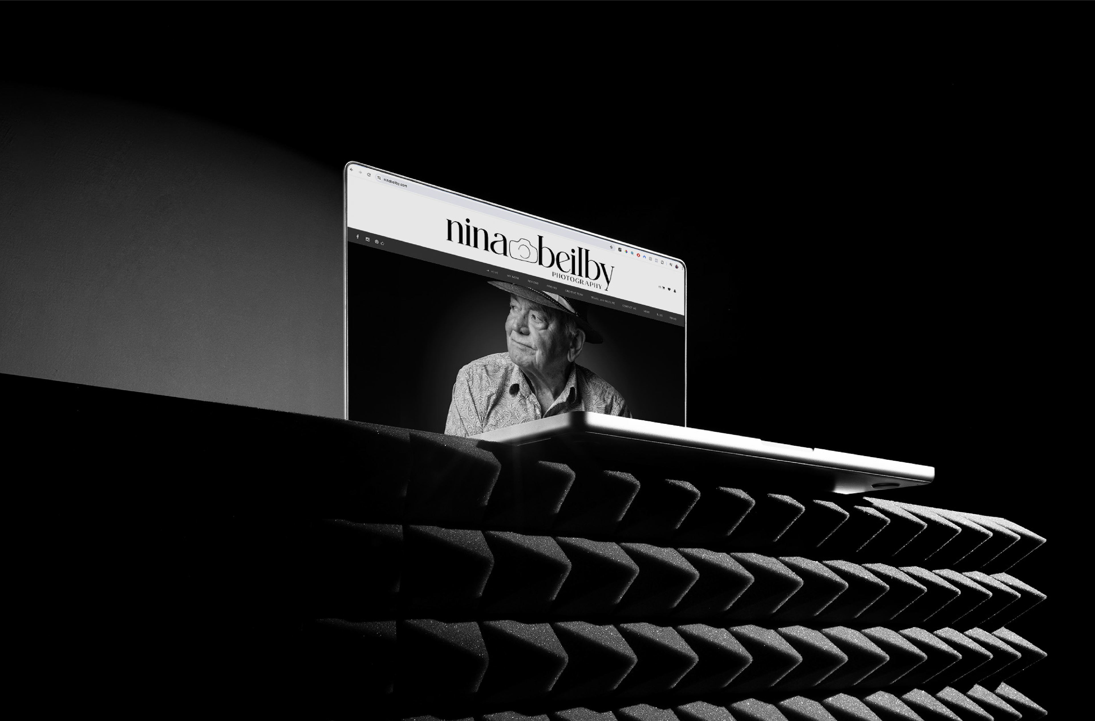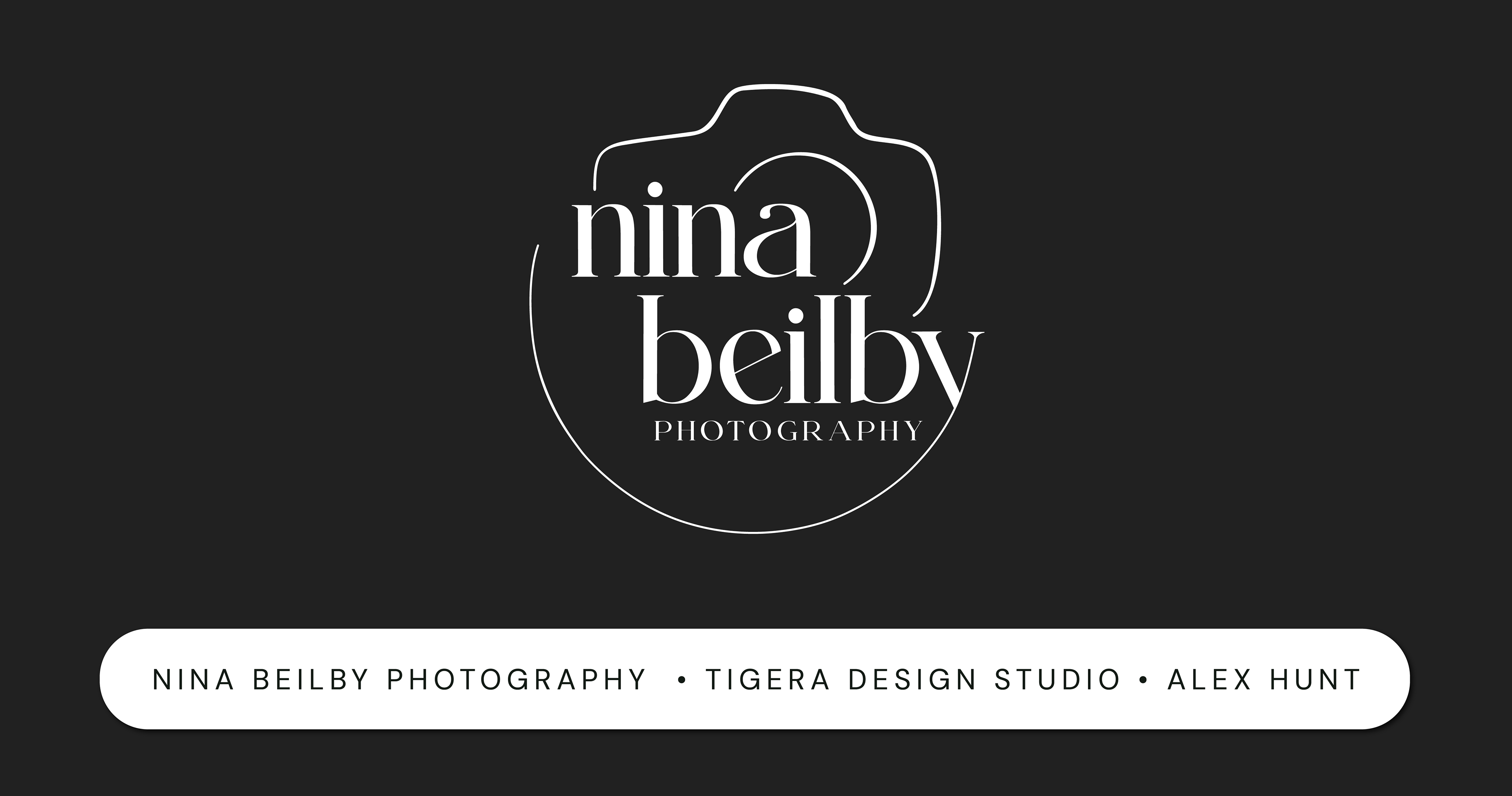
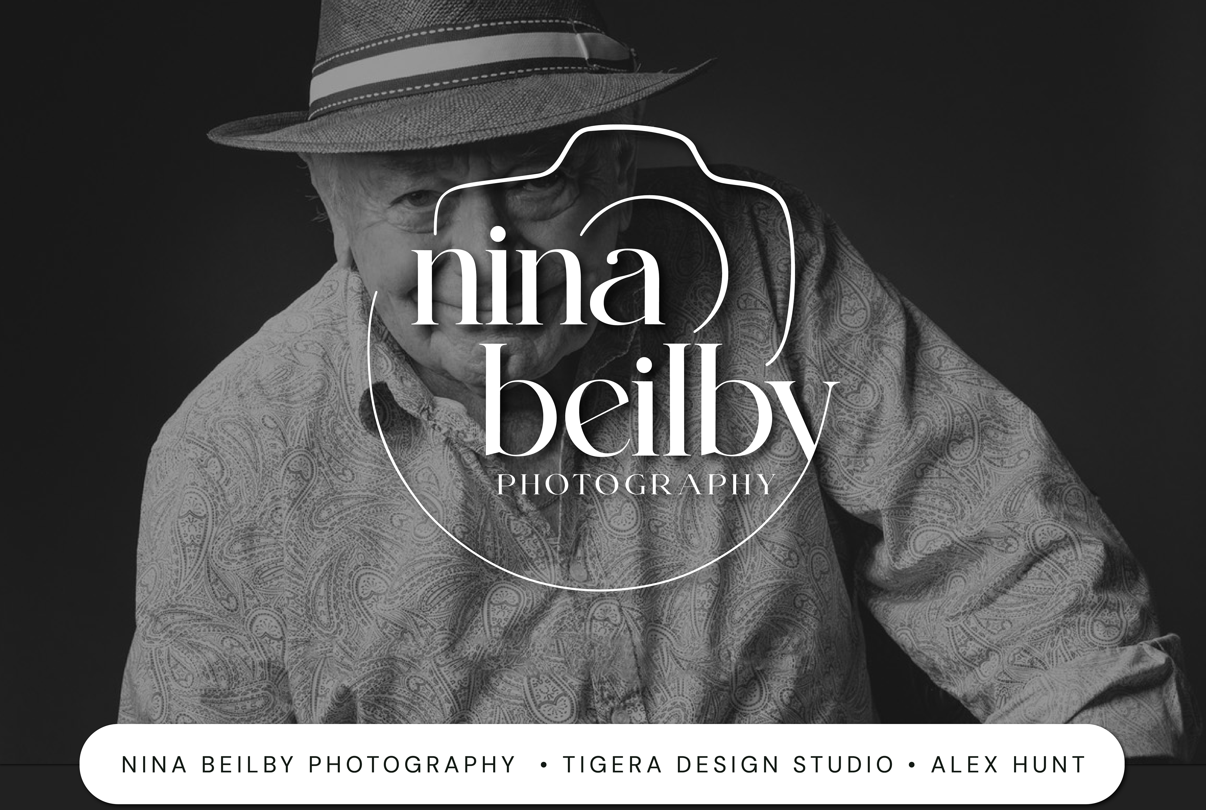
Nina Beilby is a highly qualified and experienced photography professional, specialising in portraiture and corporate headshots. She sought to update her logo to move away from script fonts for better readability and to create a rounded primary logo that communicated her professionalism while appearing refreshed and modern.
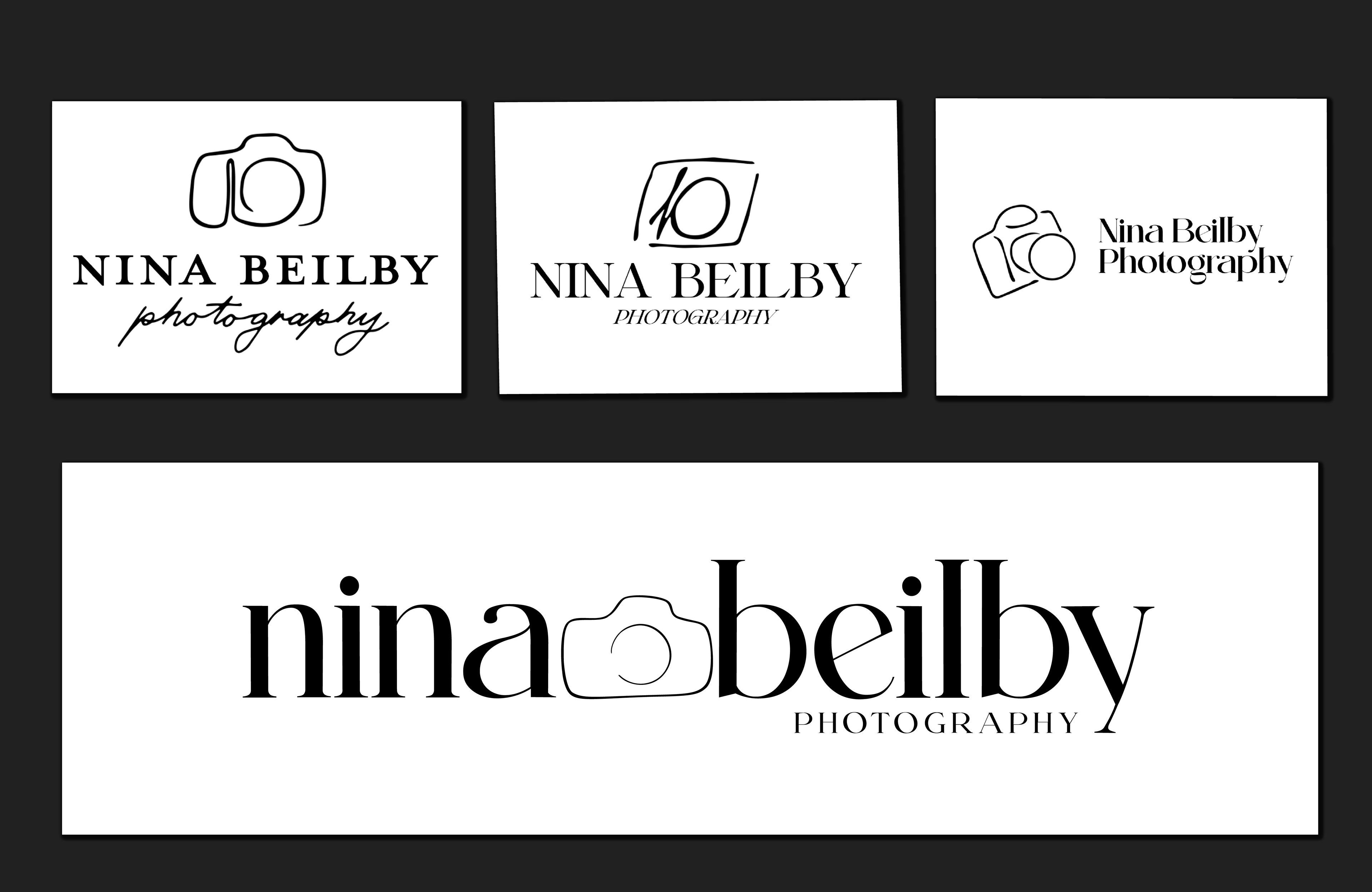
I worked closely with Nina to understand her brand and the message she wanted to convey. To achieve a clean and modern look, I designed a logo with rounded elements that avoided the use of cheesy or stereotypical photography icons. Instead, the design focused on simplicity and clarity to ensure her name was easily readable. The new logo was crafted to reflect her professionalism and expertise, while maintaining a fresh and contemporary appearance.
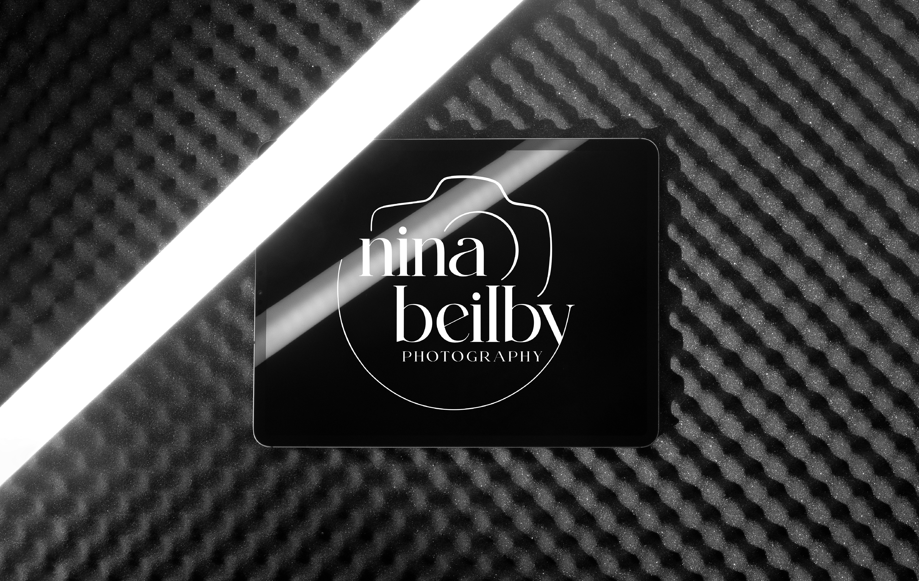
Nina Beilby Photography now has a modern and professional logo that enhances the readability of her name and effectively communicates her brand values. The updated design successfully moves away from the previous script fonts, providing a refreshed look that appeals to her target audience.